Living in LA
This is the third of four posts about events from 50 years ago, taken from the draft of Lay It Out.

LOS ANGELES (in 1972) was easy to get used to. A change for me from the older cities I knew (New York, Chicago, and Washington), it shared the new, chaotic, automobile-centered sprawling soul of Houston. Unlike that city where my parents moved in 1965, which my friend Tom Curry described as “nice and flat,” it was a geographical delight. LA had the ocean to the west, and the mountains on the east, when you could see them. Supposedly, air pollution was declining, but the San Gabriel Mountains were visible behind the downtown buildings only on the day after a big winter storm. The first time I saw them, I was startled. Pasadena, a garden for the rich in the 1920s, was in decline then because of the smog, and I avoided it, as I did Glendale, Burbank and the entire San Fernando Valley.

After 75 years of boom, the city’s infrastructure was beginning to age. There was a lot of concrete, and there were a lot of cracks. The bridges on the Harbor Freeway (opened in 1940) were turning yellow. In West LA they tried to keep everything freshly stuccoed and painted, but some buildings sat unchanged since the 40s, and were looking a bit frayed compared to the sleek new boxes with glass curtain-walls that appeared next to them. The random development pattern reduced the pretention of the new stuff. The rush of real estate and the absence of city planning gave the city a patchy streetscape that persists to this day.
The city had a diverse population with many Hispanics, Asians, and Blacks, but out in Westwood it was mostly white: A lot of young people, my age and younger, with blond hair bleached by the sun. These were the people on TV. I had assumed the clean, healthy, and tan extras in prime-time series were carefully cast. But no! They all looked like that around UCLA. The agents could just round them up at the malls and movie theaters.
Looking around for an apartment, I realized at my salary I could actually rent a small house—not in Westwood or Beverly Hills perhaps, but just to the east, in West Hollywood. I found a four-square bungalow on Lloyd Place for $200 a month, with two bedrooms and a classic breakfast nook in the kitchen. Along the back fence was a thriving row of papyrus, very exotic. There was a tiny garage that had been converted to an apartment, and I rented that out to Paul Cheslaw. That left money for food, wine, and a little marijuana. A lid of reefer was $15, but it could last a week.
Across Doheny, the next big street, were the flats of Beverly Hills, a sea of boring four-story apartment buildings. So, we didn’t think we were living in a rich neighborhood. If I turned right on Doheny, the next light was at Sunset Blvd. On the corner was a big liquor store, Gil Turner’s, which delivered! The strip was just to the east, and Sunset Records and the Whisky a Go Go were right there.
Going left on Doheny, I was quickly at Santa Monica Blvd. On the far corner was a Ralph’s supermarket there, where I got my food, and the Troubador, the famous folk-turned-rock club that was getting increasingly hip. I liked to drop in there if I had the $10 cover.

Free time
My social life was in the company of folks from LA—the only people I knew in town. But the locals had friends. There were a lot of dinners out, and plenty to drink, and lots of music. Or we would just sit around the house, smoke grass, and listen to music: Bowie, Elton John, the Doobie Brothers, and the Eagles.
In our free time, we talked about the culture, design and LA, the newspaper. And in the office, we listened to records, smoked grass, and talked about the same things. It was continuous.
Bill Cardoso, who didn’t appear on the first mastheads but became the number-three editor, lived a couple of blocks away with his wife Susan and two big Irish wolfhounds. Each was as eccentric as Bill. The four of them crowded into a ground floor apartment. The living room faced a small paved courtyard with a sliding glass patio door. The dogs often wanted to go outside, and houseflies buzzed in when the doors opened. During one visit the flies were bothering Bill, and he got up and slid open the door. Then he went to one corner of the living room and started caterwauling his long arms and wiggling his fingers. He moved slowly toward to the door, gathering the flies in front of him, and shooed all of them back into the courtyard. He quickly closed the door.
Cardoso listened to jazz, smoked pot, and was fond of opium. He still was doing acid from time to time, which I thought was a part of the 60s, and he drank plenty of wine. The result was an endless stream of stories about his life in the immigrant Portuguese community of Cambridge, Massachusetts, his work at the Boston Globe, and his “retirement” to Las Palmas in the Canary Islands where he opened a jazz club called Apple Core. One day in the fall of 1972 I dropped in, and there sitting on the sofa was Hunter S. Thompson, whose epic Las Vegas piece in Rolling Stone made a big impact on me the previous year. (That’s when I started dreaming about becoming the art director there.)
The two were like brothers, peas in a pod. Talking about the cultural divide and other current topics at full speed, often simultaneously, with impressive erudition, surprising lucidity, and constantly increasing invective. I thought that this is what it must have been like in the 20s when my mother sat listening to H. L. Mencken, one of Thompson’s early heroes, whose own command of the language was stimulated by all the cigars and Baltimore beer. In Gonzo Papers, Thompson wrote, “Mencken understood that politics—as used in journalism—was the art of controlling his environment, and he made no apologies for it.”
Gonzo. That was the word Cardoso applied to Thompson’s style, and it stuck. He explained that this was Guee (Portuguese immigrant) slang for “gone,” like when a baseball is hit out of the park. It was regular part of his vocabulary.
Whatever he was on, Cardoso turned out great stories for LA, including covers about violent gatecrashers at the Playboy Mansion, unrepentant Manson adherents, and the bizarre escapades of a fading Hollywood star, Terry Moore.
All have sharp and insight into the underbelly of American society. My favorite feature was a profile of Monti Rock III, the transplanted New York celebrity hairstylist who had a salon at Saks in the 60s and made frequent appearances on Johnny Carson’s show. No one ever knew why he was a celebrity, which increased his appeal. “I’m the first honest phony,” he told Cardoso.
Three years later, Mr. Rock, as The New York Times called him, released the first of three hit disco albums, Disco Tex and the Sex-O-Lettes Review. But in LA in 1972 he was casting around for something to hang onto and became friends with Cardoso after the article ran. I saw him a few times and went to a chaotic party with a wide mix of people at his apartment in the Beverly Hills flats. I talked mostly to his boyfriend, Lenny Lenstrom. One time I asked Monti why he became a hair stylist. He smiled and said, “Because when your naked, the only style you have is your haircut.”


The end
LA published only 24 issues. The last was dated December 16, 1972.
The first omen came in October when the company moved to Beverly Hills. We rented actual offices in a slightly deco building on Wilshire Blvd. Someone said during the tech boom, “When a startup moves to shiny new offices, sell your stock.”
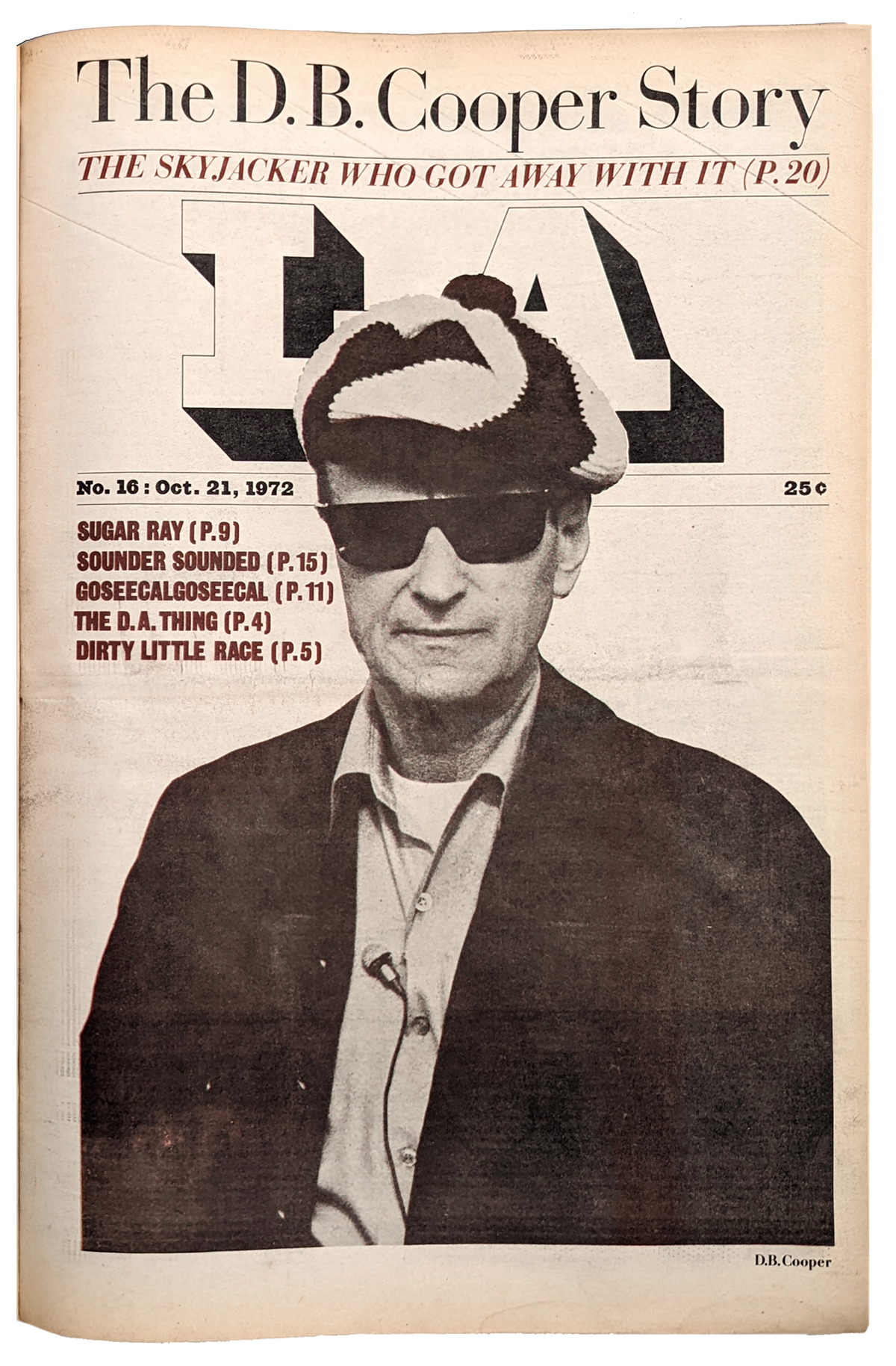
Then Fleming bet the farm on a big scoop that had come his way. He was convinced he had found D. B. Cooper, the hijacker who the year before bailed out of a Northwest Airlines jet with $200,000 in ransom money. He put the story on LA’s front page (October 21) with a photo of the man claiming to be Cooper on the front. I asked why LA should publish this story, since it had nothing to do with Los Angeles, but Fleming said he had advice he had to publish it or he could be charged with withholding evidence. Fleming had put up $30,000 to get hard proof, some of the $20 bills with serial numbers used in the ransom payment. All I ever saw were Xeroxes of the bills, which we reproduced in the paper—including as a step-and-repeat border on the department headings.
After running a second part the next week, the FBI pushed back hard—telling Fleming that he had been conned. The bills were counterfeit. Passengers on the plane did not recognize the photos that Fleming had of the imposter. And the feds questioned whether anyone with a plan would have bailed out of the rear door of a Boeing 727 in late November into a thunderstorm (0° F, 100 mph wind). They doubted he survived.
In a third part (November 4), he did not exactly recant the story, but admitted, “I jumped high and fell hard.”
This might not have mattered much to the readers or advertisers, but LA’s backer, Max Palevsky, lost faith in Fleming. Palevsky was looking to build a local power base (I assume). He had made his money in tech; the company he started, Scientfic Data Systems, was a pioneering manufacturer of minicomputers. His $60,000 investment netted him about $100 million when the company was sold to Xerox in 1969. That would make him nearly a billionaire in today’s money. Palevsky had another investment in publishing that year, Rolling Stone. His entry in Wikipedia asserts he rescued the magazine from “financial ruin” in 1970. But the founder Jann Wenner says that the company didn’t need the money and used the investment to establish a valuation for the company. Also 1972, Palevsky made a big contribution to the McGovern presidential campaign. Both relationships, the magazine and the candidate, were ended abruptly. So it was with LA.
We printed the December 16 issue, No. 24, with 40 pages and a non-Christmassy cover about Mexican American gangs. The VIP typesetter had arrived and we started to use its output in the issue, planning to go entirely in-house in the New Year. I was delighted by the shiny new AKI keyboard, which had memory, a green CRT screen, a trackball, and a six-level paper tape punch. Not WYSIWIG, but you could move, delete, copy, and paste text on the screen. If there were elaborate corrections marked up by an editor, you could make the fixes and generate a new tape for the VIP, to get a clean repro galley for pasteup.
But when we came to work on Monday, the 18th, and found that there was to be no new year for LA. In a staff meeting Karl said that Max was pulling the plug. We were all given the next two weeks’ pay in lieu of severance.
In a daze, I went into a meeting with the senior managers about winding down the operation. Running the meeting was the new publisher, LA’s first, Herb Yager, who had been an account executive at Carson-Roberts, a big and prestigious Los Angeles ad agency. The year before, it was acquired by Olgivy & Mather, pushing Yager out of a job.
I asked the group, “Can we keep going without Max?” Yager said, “No.” I asked, “Are we paid up on our bills? Do advertisers owe us some money?”
“What, and go out on a limb, without a backer?” Yager said. I said, yes. It worked for Boston After Dark, which was funded entirely by the staff’s ideas and energy. Yager said, “I can’t do that. I have a name to uphold in this city.”
I asked, “What gives you the authority to make this decision?”
“I’m the publisher,” he said.
“No, you’re not.” I replied. Yager gasped. “You are not publishing anything so you have lost the title. Let’s find a publisher who will keep LA going. If advertising is coming in, we can raise the money to continue our circulation growth. In the meantime let’s get the printer to give us some time and a discount in exchange for some stock.” I was thinking we could skip an issue around Christmas, and resume in the new year.
I was voted down.
Fleming no longer had the energy after the D. B. Cooper debacle. And Ramo, the real business manager, had had enough; he had lost his six-month battle to keep Palevsky on board. (Yager went on to partner with Saul Bass, turning his studio into a global visual branding agency with clients like AT&T and United Airlines.)

Lessons learned
Looking back at LA 50 years later, it’s a lot better than I remembered. A tenth of those pages still look good.
What had I learned in 24 weeks?
The art department was experimenting the whole time, and so where the editors. That’s what made LA great: Its willingness to try things, to go a little outside the center. We were taking the usual elements of a publication and adding energy and a new roadmap. Sometimes we ran right off the road, and with no time or budget for backup, we had to print the failures. If you can read articles in the images here, you’ll find some dog food. And lots of sloppy editing and pasteup. But we were not trying to be revolutionary, just unconventional. Avoiding the underground, we wanted to avoid the boring, as well. We felt that the traditional forms—good reporting, good writing, good photography, and good typography could be the basis of a a new kind of weekly newspaper. And we made one one, if only briefly.
The early issues relied to much on stock art, particularly the old LA pictures that I liked, and which came free from places like the Security Pacific Bank collection. The first “LA Guides” were illustrated mostly with stock art—old engravings, pictures of LA in the 40s, and movie publicity photos, also from the 40s which we thought was the decade that defined LA culture. Later, we added photos for the key items. (For just one issue Strick drove all over, taking photos for the listings.
Peter Green did more work than I remembered, including several covers. The combination of Blue and Davis (see Part 1) added a bit of the slickness I had been looking for. Brian Davis recreated the D. B. Cooper for the inside of issue No. 16—the only four-color image LA ran.
The heart of the visual content of LA was the photography. David Strick’s work holds up as well as anything else. Other staffers jumped in. Terry McDonell was more a photographer than a writer for most of the run—and a fine photojournalist. Karl Fleming took a number of pictures, as did two two designers, Tom Ingalls and Jim MacKenzie.
Looking at the bound volume, it is easy to see how the design of the paper evolved. We started as a tabloid front page and moved to more of a cover. I tried to run stories over the fold, but got better at making the headlines work, with some experience. I refused to jump copy to the back, except from the front page, and we got better at making the page flow a bit more fluid for the reader. Better than going over the fold was to continue to the next page, even if there was only another column of text. I thought this would help drag people through the issue.
As in a magazine, I tried to think in terms of two-page spreads, where one story could take more than a page, and the rest of the space was an unrelated story, set off by different headline type.
Departments in the front-of-the-book had a consistent style throughout the 24 issues: A heading in 24-point Egiziano, with a ornamented rule stretching over the copy. Each week we made new rules, usually making litho film of dingbats that we could set, step-and-repeat, on the Phototypositor. Fantastic! One issue we took palm trees from Ed Rucha’s book, A Few Palm Trees. Rucha loved the allées of spindly palms lining the old streets of Los Angeles. I have no recollection if we got permission or paid him anything.
In the back, I began to “snake” the reviews like the items in the New Yorker’s “Talk of the Town.” This allowed editors a little more flexibility in terms of story length, and made the pages look more interesting.
Eventually, I learned that we needed captions under the pictures, and that captions were a good way to intrigue readers, or at least to give them some of the content even if they weren’t reading the all the text. It took ten years before I adopted Lou Silverstein’s The New York Times law: A caption under every picture.
At the end, with fronts like “Thank You, Jesus,” “Isherwood,” and “Gangs of the Barrio” the issues were getting consistent and strong. Sure, there were weak spots, but given another six months, and it might have been pretty good!
As it was, the art department had knitted into a delightful team. Music played most of the time. We listened to KRLA-FM, one of the first great alternative rock stations with Shadoe Stevens as program director and DJ. McKenzie and Gasnier were fond of the Dr. Demento Show on KMET, another radio genius, who loved to play old novelty singles like, “Pico and Sepulveda.” When that one came on, Jim and Scot would start dancing around the room, brandishing their T-shares like spears. Ingalls and I would join in, sometimes reluctantly joined by Katherine Zogby-Bothum, who worked in the next room designing promos and “pub-set” ads, with good effect and great speed.
Parrish had cured most of the production insanity, which helped his concentrate on quality. The designers had gotten really good. And it was fun. But then, suddenly, it was over.
I had to take stock. After six months I was an “established” publication art director. I had assumed that I could just declare that I was one, since the ranks were so thin, but now I had 700 pages for a publication design portfolio—at the age of 24. Of course there were no publication art director jobs in the want ads of the LA Times. I figured I could survive on freelance work until I got hired again. It never occurred to me to file for unemployment.
_ _ _
LA, No. 20
With issue No. 20, we were hitting our stride. The typography was very active, but consistent. Little did we know that there were only to be four more.


_ _ _ _
In the fourth (and last) post on LA, I’ll review the ideas I had about an eclectic font library, and about how layouts can keep a reader’s interest.
For the first two posts, see the home page.